A collection of assorted footsteps from the journey in designing an interface for a new mobile operating system. How to create value through design in places others cannot. How to focus on your own design game and avoid competing head-on. How to create emotional responses through engaging design to stay afloat in the ruthless hardware centered mobile landscape.
Showing posts with label User centered design. Show all posts
Wednesday, October 7, 2015
Do you like it? Part 3
After reading posts one and two, you already know that short term feedback easily discourages change. It's very unforgiving to anything that's different in general. But - the longer you've been working on your new product concept, the more you actually need short term feedback to move forward.
When you choose to expose people to your mind-bending innovation for the first time, you're obviously interested in problems they face. Those reasons are the real roadblocks between you and a succesfull consumer product - not the fact that it's different. The reason these roadblocks are hard to spot by designers and engineers building the product, is because the first impression is hard to simulate.
The work that has gone into your product, is founded on top of technologies, conventions and patterns introduced by products that came before it. This means that your user interface will send messages that work against your new ideas. Those messages are causing test subject's brain to spit out incorrect suggestions how to interact with it, making the product appear 'unintuitive'. The point of these quick feedback sessions is to identify and fix those characteristics sending bad signals, not to validate the design itself. The long term feedback is used for that.
Simply kicking out unwanted messages saves a boatload of time and money, because you're not adjusting the product concept to match those unwanted messages (that weren't supposed to be there in the first place). This protects the core breakthroughs and principles that originally encouraged people to turn it into reality, as well as invited others to buy it. Without the need to do large architectural changes, more effort can be invested to stability and feature completeness. Everyone wins.
Building products with entirely new qualities, that bring real value to end users (and force the competition to do the same), requires a lot of cage rattling. Great products will not happen on their own. It requires a lot of passion, courage and determination to help people transcend their previous experiences. You're building them a friendly and motivating passage through the fear of change.
And when you take people to places they didn't know existed, their emotional response to that will be beyond 'liking'.
Thanks for reading and see you in the next post. In the meantime, agree or disagree, debate or shout. Bring it on and spread the word.
Saturday, October 3, 2015
Do you like it? Part 2
The previous part introduced the problem of asking around for quick 'likes'. This post dives deeper into what makes the short term feedback so dangerous for new product development process.
The biggest challenge with short term feedback is how it forms. When people see or experience something for the first time (like your groundbreaking new product in this case), their brain is unconsciously trying to match that with any prior experience.
Time for a painfully accurate comparison: the human brain is like Microsoft's Office Assistant. It will suggest you things based on the information available to it. Irrelevant information will return irrelevant suggestion
Short test situations will give you plenty of data about dominant products that have been succesfully launched, but absolutely nothing to complete something that hasn't existed before. End users don't have the same vision that you have, nor have they used the product long enough for that vision to materialize.
Because people can't predict the future for you, they will be more than happy to tell you about their color preferences . Or about their hobbies, funny relatives and cute pets. You will hear why they like a certain font or type of food. Anything that comes to mind, really. Obviously, it's not their fault but yours. You're expecting answers they don't have; for problems they don't know. You might as well be interviewing lobsters. Or Clippy.
More tragically, you've just offloaded part of your product development responsibilities onto people paying your salary. Bravo, such a genious plan to escape later responsibility if things go sideways.
If you still think that one hour casual chat sessions with test subjects is all that it takes to validate new ideas and concepts, you leave me no other choice but to question your ability to read. Because this topic is not that hard to comprehend.
More tragically, you've just offloaded part of your product development responsibilities onto people paying your salary. Bravo, such a genious plan to escape later responsibility if things go sideways.
If you still think that one hour casual chat sessions with test subjects is all that it takes to validate new ideas and concepts, you leave me no other choice but to question your ability to read. Because this topic is not that hard to comprehend.
Everyone remotely familiar with studying user behavior are probably furious by now, and wish to point out that short term feedback can give useful insight, if you know how. That's why I saved it for the final part (when I get around to write it).
Thanks for reading and see you in the next post. In the meantime, agree or disagree, debate or shout. Bring it on and spread the word.
Friday, October 2, 2015
Do you like it? Part 1
It's a well known wisdom,
that asking early whether people like the groundbreaking product you're
working on or not, has a tremendous potential.
Potential to destroy that said product, damage your brand, or even kill off your company; depending of its size.
Did that get your attention?
Potential to destroy that said product, damage your brand, or even kill off your company; depending of its size.
Did that get your attention?
Good,
because it should. The critical feedback in building new products (vs. copied), is the
long term one. As the name implies, it takes longer to form compared to the short term one. People have to use your product for months instead of hours. There's no shortcuts, no silver bullets.
Quickly dashing around for likes, opinions, ideas and suggestions is an open invitation for a disaster. You're only chasing popularity and trends. Meanwhile, important
values and product opportunities are drifting away - never to be seen or achieved again. It's a great way to inflict potentially irreversible damage to everyone in the value chain.
Alright, let's give that some time to sink in.
In the next part, I'll explain why short term feedback sucks.
Thanks for reading and see you in the next post. In the meantime, agree or disagree, debate or shout. Bring it on and spread the word.
Alright, let's give that some time to sink in.
In the next part, I'll explain why short term feedback sucks.
Thanks for reading and see you in the next post. In the meantime, agree or disagree, debate or shout. Bring it on and spread the word.
Friday, July 31, 2015
Man and its computer, part 2
In part 1, I shared my conclusions about how similar today's computers are. They all run different applications, ranging from entertainment to productivity, from simple to complex. This post will compare in closer detail how graphical user interfaces (GUIs) of said computers help people to get the best out of their investment in these devices.
When you use one for the first time, you see en
empty desktop. The apps that you bought the computer for, are hidden
somewhere else. A few app shortcuts might be visible by default, and the rest are
tucked away below multiple steps for user to configure and manage.
Indication of an application that has been sent to background, ranges from subtle to quesswork. The desktop wallpaper, as seen in examples 1, 2 and 3, has clearly the biggest emphasis. It's however not exactly why these computers exists.
For an unknown reason, all applications that have been started, are demoted and hidden to a task switcher view. A design that looks and works like an afterthought. Windowed apps are slowly starting to appear, but still feel clunky and bolted-on solutions. The experience doesn't change when the device is connected to a larger screen. Only WP and Ubuntu phone are pursuing scenarios beyond the traditional desktop and mobile divide. Kudos for both for focusing on the future.
There's no support for multiple screens, and these computers are sometimes even more limited than mobile ones, due to shortcomings of gamepad input. Xbox OS has an edge over its competition in doing several things at the same time by allowing windowed operation of some of its core features, without breaking the context user was in.
Back in the days, with just few computers around, there was no need for a common approach to GUIs. Instead, there was plenty of time, ignorance, workforce and money. As a result, we have several user interface paradigms, that all fail with various degrees. The shared mistake is focusing on building physical products with 'art directed' interfaces. A direction based on a personal perception how a particular device should be used, easily masks any digital similarities underneath the glamorous surface, abstracting important qualities all operating systems commonly share.
To sum it up..
Every 'signature charasteristics' that desktop, mobile and other interface paradigms have managed to pile up over these years, are merely distractions. They occupy minds of designers, developers and and end users alike. Our digital world is a hot mess - partly because of our obsession over the current categorization of computer GUIs and OS'es.
If something is certain, it's that software has never needed such arbitrary categorization - and neither do people using them. Future user interfaces will leverage different screen sizes and input types when they become available; instead stubbornly serving a single form factor, like they do today.
How can we help people to see beyond their lust for yesterday? How can future user interfaces better focus on increasing our human potential, if our preferences and behavior explicitly tells them otherwise?
Thanks for reading and see you in the next post. In the meantime, agree or disagree, debate or shout. Bring it on and spread the word.
Desktop and laptop computers
Phone and tablet computers
Upon starting one of these devices, user sees that applications are also divided between multiple locations, with iOS being the only exception here (example 1). It shows everything on a single location. Android (2) has multiple home screens, with all but few installed apps hidden in yet another place. Windows phone (3) is a mixture, while Ubuntu Phone (4) has much bigger plans than apps.For an unknown reason, all applications that have been started, are demoted and hidden to a task switcher view. A design that looks and works like an afterthought. Windowed apps are slowly starting to appear, but still feel clunky and bolted-on solutions. The experience doesn't change when the device is connected to a larger screen. Only WP and Ubuntu phone are pursuing scenarios beyond the traditional desktop and mobile divide. Kudos for both for focusing on the future.
Console computers
The same pattern is sadly repeated. The software that user benefits from, is divided and scattered around the main user interface. The current game/app is prominently shown, but when it comes to seeing what else is installed, or running in the background for that matter, it's not what these interfaces are intended for. And consoles are usually connected to over 40" screens, so it's not that they wouldn't have space to put it in.There's no support for multiple screens, and these computers are sometimes even more limited than mobile ones, due to shortcomings of gamepad input. Xbox OS has an edge over its competition in doing several things at the same time by allowing windowed operation of some of its core features, without breaking the context user was in.
The verdict
Even though all computers and their operating systems are near identical in terms of what they do; companies developing them have chosen very different graphical user interfaces for them to do it. It means, that:- users have to memorize different interface conventions between different computers
- multiple OS'es (or variants of them) are needed to support different devices
- only big companies have resources to develop multiple products from different categories
- massive overlap in required effort when developing software for multiple devices and/or operating systems
Back in the days, with just few computers around, there was no need for a common approach to GUIs. Instead, there was plenty of time, ignorance, workforce and money. As a result, we have several user interface paradigms, that all fail with various degrees. The shared mistake is focusing on building physical products with 'art directed' interfaces. A direction based on a personal perception how a particular device should be used, easily masks any digital similarities underneath the glamorous surface, abstracting important qualities all operating systems commonly share.
To sum it up..
Every 'signature charasteristics' that desktop, mobile and other interface paradigms have managed to pile up over these years, are merely distractions. They occupy minds of designers, developers and and end users alike. Our digital world is a hot mess - partly because of our obsession over the current categorization of computer GUIs and OS'es.
If something is certain, it's that software has never needed such arbitrary categorization - and neither do people using them. Future user interfaces will leverage different screen sizes and input types when they become available; instead stubbornly serving a single form factor, like they do today.
How can we help people to see beyond their lust for yesterday? How can future user interfaces better focus on increasing our human potential, if our preferences and behavior explicitly tells them otherwise?
Thanks for reading and see you in the next post. In the meantime, agree or disagree, debate or shout. Bring it on and spread the word.
Saturday, June 13, 2015
Tailoring graphical user interfaces for everyday life
When developing a graphical user interface for a product, it's easy
to forget the outside world; the reality that your product will
ultimately face.
It's tempting to downplay the importance of various everyday situations. Mundane, boring and even stupid situations, that have nothing to do with your amazing new product; yet everything to do with how much user attention they require. This common and critical mistake results in a struggle between the product and the environment it's being used in. Below is a simplified example of this conflict (click to enlarge).
The image shows how the environment affects our ability to focus and handle information. The more control we have over the environment we're in, the more demanding interfaces we can cope with.
Mobile and portable devices are widely adopeted because they conform to dynamic and unpredictable qualities of human life. We naturally have a lower barrier toward carrying small devices with us. Therefore a smartphone is more likely to be used inside a taxing situation than a desktop computer.
On the opposite ends of that scale, we can either be fully engaged with the environment, or with the graphical user interface. Even a familiar and simple interface will be problematic in a demanding situation. Like composing an email while outrunning a bear. Similarly, any smartwatch interface feels lethally boring and restrictive, while waiting for another meeting to end (you'd rather tussle a bear). For reference, see the following image (click to enlarge).
Our available time, at any given moment, affects what we consider important. When a situation requires any attention, completing another task will costs you situational control and awareness. The expense amount depending on both interface needs and the task complexity in question. In short, if you text and drive, you'll suck at both. Human multitasking in all its glory.
Therefore it's important for interfaces input requirements to scale accordingly. The problem is that many interfaces today, like Android, iOS and WP, are already beyond their capability to do so, forcing the user to give in. The reason is a devious one. Even if people don't like to carry around tower PCs, they still love the familiar interface logic derived from them. Even though many human interaction methods, that were developed for desktop computing, are far too demanding for the life outside those cubicles they were never meant to leave.
The smaller your product is, the more focused, effortless and fault tolerant the interface needs to be. I know that our work on Sailfish OS is not there yet either, but it's still easier to keep on building it on top of thoughts like these.
A mobile device that fits your life, is valuable. One preventing you from living yours to the fullest, is not.
Thanks for reading and see you in the next post. In the meantime, agree or disagree, debate or shout. Bring it on and spread the word.
It's tempting to downplay the importance of various everyday situations. Mundane, boring and even stupid situations, that have nothing to do with your amazing new product; yet everything to do with how much user attention they require. This common and critical mistake results in a struggle between the product and the environment it's being used in. Below is a simplified example of this conflict (click to enlarge).
The image shows how the environment affects our ability to focus and handle information. The more control we have over the environment we're in, the more demanding interfaces we can cope with.
Mobile and portable devices are widely adopeted because they conform to dynamic and unpredictable qualities of human life. We naturally have a lower barrier toward carrying small devices with us. Therefore a smartphone is more likely to be used inside a taxing situation than a desktop computer.
On the opposite ends of that scale, we can either be fully engaged with the environment, or with the graphical user interface. Even a familiar and simple interface will be problematic in a demanding situation. Like composing an email while outrunning a bear. Similarly, any smartwatch interface feels lethally boring and restrictive, while waiting for another meeting to end (you'd rather tussle a bear). For reference, see the following image (click to enlarge).
Our available time, at any given moment, affects what we consider important. When a situation requires any attention, completing another task will costs you situational control and awareness. The expense amount depending on both interface needs and the task complexity in question. In short, if you text and drive, you'll suck at both. Human multitasking in all its glory.
Therefore it's important for interfaces input requirements to scale accordingly. The problem is that many interfaces today, like Android, iOS and WP, are already beyond their capability to do so, forcing the user to give in. The reason is a devious one. Even if people don't like to carry around tower PCs, they still love the familiar interface logic derived from them. Even though many human interaction methods, that were developed for desktop computing, are far too demanding for the life outside those cubicles they were never meant to leave.
The smaller your product is, the more focused, effortless and fault tolerant the interface needs to be. I know that our work on Sailfish OS is not there yet either, but it's still easier to keep on building it on top of thoughts like these.
A mobile device that fits your life, is valuable. One preventing you from living yours to the fullest, is not.
Thanks for reading and see you in the next post. In the meantime, agree or disagree, debate or shout. Bring it on and spread the word.
Tuesday, April 21, 2015
Too much design
| www.wpsauce.com |
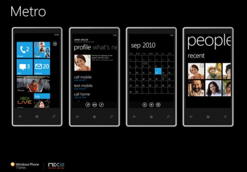
A Windows phone design article by Paul Thurrot, summarizing a "ask-me-anything" thread in reddit, reminded me about something that easily goes wrong in design: the design itself becomes more important than the product or medium it's applied to. Meaning, that more work goes into sustaining design as an activity; instead of treating it as an integrated part of making a competitive product.
What kept popping up throughout the article, was the need to differentiate Windows phone from others, through Metro's unique visual and interaction design (mainly focusing on application side though). This resulted in design importance raising out of proportion, disturbing the actual product work (make a great product). The focus was on finding a striking and novel design (too much), instead of making a relevant alternative to iOS and Android.
Alternative can mean being different, but it doesn't have to. A product that's just different for the sake of being different, is bound to have a design overdose. The only way to deliver an industry-breaking products, is by not designing it for the industry (remember what Apple did when it entered the smartphone market). That alone requires you to focus on problems that the industry tries to hide. Too much design will just make things worse.
The mobile industry has a significant ability to resist changes. Look at any usability studies. They all basically state that Android and iOS have reached the pinnacle of touch screen interaction. To put that in some perspective: they say that majority of desktop interaction patterns (the way you use mouse and keyboard to do things) are just as usable on mobile devices, as they were 40 years ago. Nonsense.
Usability studies like that show how amazingly well people adapted to our messy past with computers. Studies can always help to spot problems in both design and implementation, but the they tell nothing about our potential, our hopes, dreams or what we'll do tomorrow.
So, at the end of the day, those studies tell that the industry doesn't want to be broken.
"To go against it (industry) you need to earn it. You need to be far, far better." Being different for the sake of difference, is not enough.
With Metro, Microsoft experienced the hard way what happens when you put in too much design, at the expense of end user value. It failed to be relevant.
Thanks for reading and see you in the next post. In the meantime, agree or disagree, debate or shout. Bring it on and spread the word.
Tuesday, March 31, 2015
The story of SailfishOS browser
Why on earth would someone start yet another browser project, when there's so many already out there? Well, because all mainstream browsers are more or less scaled down desktop browsers, than something designed with one handed mobile use in mind.
Looking at the image above, the two examples from the left are impossible to comfortably use without altering your hand grip. Also the reason for such design is obvious just by looking at desktop browser interfaces: they hardly need to be operated with one hand alone. I mean, try lifting your desktop/laptop with one hand, and enter a website address.
Even if you can somehow do it, it's not comfortable; and downscaling that interface design to 5" screens does not change that. You'll still need both hands to operate it, which is an unacceptable requirement for a simple tool that should increase your potential, not decrease it.
And that's where the third example on the right comes to play. Obviously, we're not doing everything by ourselves. We chose to build our web browsing experience on top of Mozilla's Gecko rendering engine, developed for the Firefox browser.
Then, let's look at the two major steps we took before ending up with the current SailfishOS browser design. There's some good things we learned along the way.
Version one
In addition to moving the toolbar down, the first design (click to enlarge) used separate pages for both tabs and website address. The aim was to avoid the performance hungry scenario, where some web content is rendered in the background, a virtual keyboard is open, and there's search suggestions on top of everything.
The toolbar had buttons for back, address field, tabs, reload/stop and forward. In the end, the design was discarded as too complicated to understand. The root cause was in the magnifying glass icon. People didn't associate it to searching the web.
Version two
The next image shows the design that actually shipped with the Jolla phone sales release (click to enlarge). It combined both tab and addres entry into a single page. And instead of a separate address eentering icon, it promoted easier bookmarking.
We got a lot of negative feedback for that design, as it added an extra step to searching something or entering page address, and also made tabs functionality unnecessarily complicated to understand, use and develop.
Version three
The current design brought back separated tabs and address entry points. Tabs still use a page, but the latter one behaves like a toolbar extension, so that you can still see a bit of the webpage underneath. Much more useful functionality was also added throught the expanding/collapsing toolbar.
The feedback has been really good, and although I'm not completely happy about two different gestures to get back to browsing (flick address overlay down to close it vs. flick tabs page right to close it), we're much closer to a modern mobile browser interface.
Something that supports the way your hand works, instead of how you moused around in desktop interfaces few decades ago.
Thanks for reading and see you in the next post. In the meantime, agree or disagree, debate or shout. Bring it on and spread the word.
Looking at the image above, the two examples from the left are impossible to comfortably use without altering your hand grip. Also the reason for such design is obvious just by looking at desktop browser interfaces: they hardly need to be operated with one hand alone. I mean, try lifting your desktop/laptop with one hand, and enter a website address.
Even if you can somehow do it, it's not comfortable; and downscaling that interface design to 5" screens does not change that. You'll still need both hands to operate it, which is an unacceptable requirement for a simple tool that should increase your potential, not decrease it.
And that's where the third example on the right comes to play. Obviously, we're not doing everything by ourselves. We chose to build our web browsing experience on top of Mozilla's Gecko rendering engine, developed for the Firefox browser.
Then, let's look at the two major steps we took before ending up with the current SailfishOS browser design. There's some good things we learned along the way.
Version one
In addition to moving the toolbar down, the first design (click to enlarge) used separate pages for both tabs and website address. The aim was to avoid the performance hungry scenario, where some web content is rendered in the background, a virtual keyboard is open, and there's search suggestions on top of everything.The toolbar had buttons for back, address field, tabs, reload/stop and forward. In the end, the design was discarded as too complicated to understand. The root cause was in the magnifying glass icon. People didn't associate it to searching the web.
Version two
The next image shows the design that actually shipped with the Jolla phone sales release (click to enlarge). It combined both tab and addres entry into a single page. And instead of a separate address eentering icon, it promoted easier bookmarking.We got a lot of negative feedback for that design, as it added an extra step to searching something or entering page address, and also made tabs functionality unnecessarily complicated to understand, use and develop.
Version three
The current design brought back separated tabs and address entry points. Tabs still use a page, but the latter one behaves like a toolbar extension, so that you can still see a bit of the webpage underneath. Much more useful functionality was also added throught the expanding/collapsing toolbar.
The feedback has been really good, and although I'm not completely happy about two different gestures to get back to browsing (flick address overlay down to close it vs. flick tabs page right to close it), we're much closer to a modern mobile browser interface.
Something that supports the way your hand works, instead of how you moused around in desktop interfaces few decades ago.
Thanks for reading and see you in the next post. In the meantime, agree or disagree, debate or shout. Bring it on and spread the word.
Saturday, February 28, 2015
To evolve, or not to evolve?
That's not even a question.
Be it building shelters, gathering food or traveling long distances; people always had an innate desire to do things better and faster. It's been always possible to improve some part of an activity or a tool related to it. Even entire professions have been forgotten after becoming obsolete. Thanks to the increasing pace of technological advancements, our children won't anymore recognize objects their parents grew up with.
Except when it comes to user interfaces.
I grew up with computers around me, and my kids will grow up with even more computers around them. Over the years, they've gotten a lot smaller and immensely more powerful. What hasn't really changed, is the graphical user interface staring back at us. The desktop metaphor with windows, icons, menus and a pointer (WIMP) has stayed intact for over 40 years.
The first mobile devices had no touch screens, and had to be navigated with either directional keys or a scroll wheel. It was logical to use the same approach for such a miniaturized desktop, but when touch screens became more popular, user could directly interact with things. This made controlling a pointer redundant.
After the mouse pointer was removed and touchable things made a bit bigger for suitable finger operation, everything was ready for profit-making. Nobody seemed to question, whether an interface paradigm originally designed to be operated with a keyboard and mouse (WIMP), was really applicable for a mobile touch screen use:
Unlike desktops, mobile devices
Regardless, all mainstream mobile operating systems treat mobile use the same way as desktop use. The familiar button-based navigation model, dating back 40 years, does not really qualify for mobile use. It requires too much attention from it's user to be efficient. Too much precision to be comfortable. Too much time to be fast.
Replacing mouse and keyboard with touch alone, just decreases the speed user can control the system, making it actually worse than the desktop. It's been a wobbly decade of mobile user interface infancy. The only way it's gotten any better, is through nicer visuals and smoother transitions. But that's just surface - a better hardware clad in finer clothes.
At this rate, my grandchildren can still identify an Android phone, because baby steps were considered good enough. That's a valid strategy as long as everyone copies one another, and no alternatives exist: a family tree that looks like a ladder. It's an open invitation for smaller companies to deliver less inbred products, that are designed to adapt to your life, instead the other way around.
If you still think those archaic desktop conventions are enough to keep your massive software business afloat today, you're not the first one. The bad news is, that the only way a dinosaur could avoid extinction, was to stop being one, and evolve into something else.
Before it was too late.
Thanks for reading and see you in the next post. In the meantime, agree or disagree, debate or shout. Bring it on and spread the word.
Be it building shelters, gathering food or traveling long distances; people always had an innate desire to do things better and faster. It's been always possible to improve some part of an activity or a tool related to it. Even entire professions have been forgotten after becoming obsolete. Thanks to the increasing pace of technological advancements, our children won't anymore recognize objects their parents grew up with.
Except when it comes to user interfaces.
I grew up with computers around me, and my kids will grow up with even more computers around them. Over the years, they've gotten a lot smaller and immensely more powerful. What hasn't really changed, is the graphical user interface staring back at us. The desktop metaphor with windows, icons, menus and a pointer (WIMP) has stayed intact for over 40 years.
The first mobile devices had no touch screens, and had to be navigated with either directional keys or a scroll wheel. It was logical to use the same approach for such a miniaturized desktop, but when touch screens became more popular, user could directly interact with things. This made controlling a pointer redundant.
After the mouse pointer was removed and touchable things made a bit bigger for suitable finger operation, everything was ready for profit-making. Nobody seemed to question, whether an interface paradigm originally designed to be operated with a keyboard and mouse (WIMP), was really applicable for a mobile touch screen use:
Unlike desktops, mobile devices
- are primarily used without a supporting surface (table or similar)
- are used in dynamic environments with disruptions
- can't assume user is constantly looking at the screen
- can't assume both hands are available for a basic operation
- can't assume equal amount of time is available to perform a task
Regardless, all mainstream mobile operating systems treat mobile use the same way as desktop use. The familiar button-based navigation model, dating back 40 years, does not really qualify for mobile use. It requires too much attention from it's user to be efficient. Too much precision to be comfortable. Too much time to be fast.
Replacing mouse and keyboard with touch alone, just decreases the speed user can control the system, making it actually worse than the desktop. It's been a wobbly decade of mobile user interface infancy. The only way it's gotten any better, is through nicer visuals and smoother transitions. But that's just surface - a better hardware clad in finer clothes.
At this rate, my grandchildren can still identify an Android phone, because baby steps were considered good enough. That's a valid strategy as long as everyone copies one another, and no alternatives exist: a family tree that looks like a ladder. It's an open invitation for smaller companies to deliver less inbred products, that are designed to adapt to your life, instead the other way around.
If you still think those archaic desktop conventions are enough to keep your massive software business afloat today, you're not the first one. The bad news is, that the only way a dinosaur could avoid extinction, was to stop being one, and evolve into something else.
Before it was too late.
Thanks for reading and see you in the next post. In the meantime, agree or disagree, debate or shout. Bring it on and spread the word.
Saturday, December 13, 2014
Follow-up: Why the status bar has to go
My earlier post, about calling a persistent status bar a ghost of desktop days, got somewhat mixed reception. I was mainly talking about individual details, and forgot to summarize the big picture.
I'd like to take another swing at the topic from a less technical angle, by asking why do we own smartphones?
Everyone uses them to communicate with people important to them. We use them to consume content through any channels available. We all have slightly different ways we use them. Others take things further, while the rest settle for less. But everyone has one thing in common; we all do it on the go.
We pay money to carry a piece of technology around all day, to do all these things when we want to. The value comes from the device enabling communication, access to information and entertainment. It exists so that we don't have to be tethered to our grampa's box all the time.
I don't understand why are we required to babysit our devices all day, using that small bar at the top of the screen?
When facing a critical error, all smartphones have that "I just soiled my pants" -look of a small child on their faces. But children are much easier to debug, because all issues are local. With cellular reception woes, the catastrophe can occur in places you don't even know that exists. You're only left with the stink.
We must stop traveling a road, where you have to keep one eye on the status bar and one on the content. We can't live under a constant fear of our devices jumping off a cliff the moment we're not able to see the status bar. It's a UX shot so wide, that you could park Jupiter with its moons between it, and the "smartphone" target you we're aiming at.
Making better products and better software is not easy, and will only happen gradually. Nobody makes software that behaves badly on purpose. It's bad because we, as users, are holding on to certain things extremely tight. We're constantly demanding more features on top of the old ones, without understanding the complexity it invites. Complexity in the software is the same for bugs, what blood in the water is for sharks. An open invitation to ruin your pool party.
That's why rebooting the smartphone value domain is important to see what is really needed.
Look at any, big, companies, that are throwing thousands after thousands of developers and testers at their software products, to keep the quality on an acceptable level. Even they struggle to keep the water safe for swimming. They're not bad at software, but their products are simply unwieldy.
And they're complex because we demand them to be. So make sure you demand only what you really need, because it will affect with who you're sharing your swimming pool?
Is it with people important to you? Or with bunch of f*cking sharks?
The decision is yours.
Thanks for reading and see you in the next post. In the meantime, agree or disagree, debate or shout. Bring it on and spread the word.
Everyone uses them to communicate with people important to them. We use them to consume content through any channels available. We all have slightly different ways we use them. Others take things further, while the rest settle for less. But everyone has one thing in common; we all do it on the go.
We pay money to carry a piece of technology around all day, to do all these things when we want to. The value comes from the device enabling communication, access to information and entertainment. It exists so that we don't have to be tethered to our grampa's box all the time.
I don't understand why are we required to babysit our devices all day, using that small bar at the top of the screen?
When facing a critical error, all smartphones have that "I just soiled my pants" -look of a small child on their faces. But children are much easier to debug, because all issues are local. With cellular reception woes, the catastrophe can occur in places you don't even know that exists. You're only left with the stink.
We must stop traveling a road, where you have to keep one eye on the status bar and one on the content. We can't live under a constant fear of our devices jumping off a cliff the moment we're not able to see the status bar. It's a UX shot so wide, that you could park Jupiter with its moons between it, and the "smartphone" target you we're aiming at.
Making better products and better software is not easy, and will only happen gradually. Nobody makes software that behaves badly on purpose. It's bad because we, as users, are holding on to certain things extremely tight. We're constantly demanding more features on top of the old ones, without understanding the complexity it invites. Complexity in the software is the same for bugs, what blood in the water is for sharks. An open invitation to ruin your pool party.
That's why rebooting the smartphone value domain is important to see what is really needed.
Look at any, big, companies, that are throwing thousands after thousands of developers and testers at their software products, to keep the quality on an acceptable level. Even they struggle to keep the water safe for swimming. They're not bad at software, but their products are simply unwieldy.
And they're complex because we demand them to be. So make sure you demand only what you really need, because it will affect with who you're sharing your swimming pool?
Is it with people important to you? Or with bunch of f*cking sharks?
The decision is yours.
Thanks for reading and see you in the next post. In the meantime, agree or disagree, debate or shout. Bring it on and spread the word.
Friday, December 12, 2014
Ambience: the story behind Sailfish OS looks, part 2
In the previous part, I went through the reason to not follow what other mobile operating systems do, and stay away from a static interface style. The main problem with themes, is that they just alleviate the real problem of interfaces being static, because someone wanted it to look the same for everyone.
Instead doing small things here and there, we wanted to build the personalization story around a single strong feature. The most used way to customize a device yourself, is to change the wallpaper. But we didn't want to stop there - we wanted the wallpaper to signify how the device currently works.
To do that, it should affect also to how individual applications look. This naturally allows the image to carry more meaning to its owner than meets the eye of an outsider. The feature was named as Ambience, which means atmosphere, surrounding, mood or environment of a given place.
Here's some examples. These are screenshots of my lock screen, home screen and calculator app (click to enlarge them). In the first set, I have created an Ambience out of Orion nebula photo, and set the device to not emit any sounds when that Ambience is active. You can see the selected image being visible throughout the interface, from lock screen to the calculator.
Alright, unto the next set. This time I have selected an image that shows a circuit board as Ambience motif. More discrete ringtones and notification sounds are defined to fit my working mood and prevent disturbing others. It's easy for me to tell apart green and red interface as they carry added significance for me (both photos are personally relevant for me, and I have defined the behavior for each Ambience). Red is silent, green is discrete. No need to squint at tiny status bar icons.
Moving on to the third set, where I used an abstract macro photo to create my casual Ambience. When activated, ringtones and volumes reflect my preferences for events, going out with friends, or just idling at home. Again, it's trivial for the owner of the device to understand the device behavior through meaningful images and colors instead of minuscule status icons.
To create a new Ambience, all you need is a large enough image. Download one from web, use camera to capture something nice, or create a unique piece with your favorite illustration software. With a little bit of testing, anyone can do it. Results will often surprise you. It's an invitation to explore how different kind of images work and shape the appearance of your device. Use images relevant to you, don't follow but pave your own style. Be playful and try different things. Delete the bad ones and enjoy keepers.
Sailfish OS Ambience journey has just barely started and currently only includes partial sound settings. To get some idea what could be done with it in the future, take a look at what our community has already proposed. In short, it's like a visual umbrella for grouping any kind of behavior you might frequently need to change based on context.
How you make use of it, is up to you. After all, it's your personal device. And this time around, it really means it. The way your phone looks like, is not shared by anyone else.
Each Sailfish OS device is unique in that sense. Reflecting their users.
Instead doing small things here and there, we wanted to build the personalization story around a single strong feature. The most used way to customize a device yourself, is to change the wallpaper. But we didn't want to stop there - we wanted the wallpaper to signify how the device currently works.
To do that, it should affect also to how individual applications look. This naturally allows the image to carry more meaning to its owner than meets the eye of an outsider. The feature was named as Ambience, which means atmosphere, surrounding, mood or environment of a given place.
Here's some examples. These are screenshots of my lock screen, home screen and calculator app (click to enlarge them). In the first set, I have created an Ambience out of Orion nebula photo, and set the device to not emit any sounds when that Ambience is active. You can see the selected image being visible throughout the interface, from lock screen to the calculator.
Alright, unto the next set. This time I have selected an image that shows a circuit board as Ambience motif. More discrete ringtones and notification sounds are defined to fit my working mood and prevent disturbing others. It's easy for me to tell apart green and red interface as they carry added significance for me (both photos are personally relevant for me, and I have defined the behavior for each Ambience). Red is silent, green is discrete. No need to squint at tiny status bar icons.
Moving on to the third set, where I used an abstract macro photo to create my casual Ambience. When activated, ringtones and volumes reflect my preferences for events, going out with friends, or just idling at home. Again, it's trivial for the owner of the device to understand the device behavior through meaningful images and colors instead of minuscule status icons.
To create a new Ambience, all you need is a large enough image. Download one from web, use camera to capture something nice, or create a unique piece with your favorite illustration software. With a little bit of testing, anyone can do it. Results will often surprise you. It's an invitation to explore how different kind of images work and shape the appearance of your device. Use images relevant to you, don't follow but pave your own style. Be playful and try different things. Delete the bad ones and enjoy keepers.
Sailfish OS Ambience journey has just barely started and currently only includes partial sound settings. To get some idea what could be done with it in the future, take a look at what our community has already proposed. In short, it's like a visual umbrella for grouping any kind of behavior you might frequently need to change based on context.
How you make use of it, is up to you. After all, it's your personal device. And this time around, it really means it. The way your phone looks like, is not shared by anyone else.
Each Sailfish OS device is unique in that sense. Reflecting their users.
Thanks for reading and see you in the next post. In the meantime, agree or disagree, debate or shout. Bring it on and spread the word.
Wednesday, December 10, 2014
Ambience: the story behind Sailfish OS looks, part 1
As a part of our daunting task of creating a new mobile operating system, a visual story (theme) for the user interface was needed. What that usually meant in the past projects, was a ton of work containing:
- appearance for system UI (things that's part of the OS itself like home, lock etc.)
- appearance for each application UI building block (buttons, sliders and switches etc.)
- launcher icon style (how app icons stand out and represent the app itself)
- generic icon style (iconography used across the OS and apps)
- creating graphical assets for actual implementation of system interface and application UI building blocks
- document how everything is implemented correctly (fonts, colors, geometry, transitions, interaction feedback etc..)
- continuously work on the documentation to fix mistakes, partial details and oversight
- add new features and update existing ones in your documentation
In most cases, one or two design teams are working on this huge pile of things. Team compositions are usually something like this:
- few chiefs for planning, leading, reviewing and managing the work
- some seniors for heading key areas
- a lot of designers to execute the design and deliver it to be implemented. Usually one per application.
That easily means work for 15-25 people. At the time when we started, we had 2. We couldn't really continue the Nokia N9 style, due to both the amount of work required (see above) and it was still part of Nokia's brand. Same restriction applied for going for Android or iOS -copycat style. Too much to do. The amount of work needed to define, implement and maintain such an UI style, would've burnt us up in no time. Not to mention delivering something like that, understaffed, with a competitive quality. We went the opposite way, do as little design as possible.
The current Sailfish OS visual appearance was born out from the idea, that it's not the interface that matters, but what's around it; starting from the user. The more we could capture that, the less visual design would be required.
Let me open that up a bit more. The less a designer dictates how an interface looks like, the more one leaves room for personal expression. The less you try to control everything, the more the interface can become adaptive, and to resemble its owner.
We didn't want to control everything in Sailfish OS. That's not what personal is about. We wanted to make it adaptive, so that every device would look unique through portraying something that's dear to the user. As a designer, you cannot decide what that something is. You need to let go and trust the user.
And we did. We didn't end up defining everything like the competition. We almost completely eliminated documentation overhead (we're not shipping that, but a product), and instead worked with the actual software. We crafted a rule-set for adaptive interface, and continue improving and developing our own personal story.
The Ambience story.
In the next part, I'll dive deeper into how the visual style works (with example pictures).
Thanks for reading and see you in the next post. In the meantime, agree or disagree, debate or shout. Bring it on and spread the word.
Tuesday, November 25, 2014
Why the status bar has to go
The small black stripe at the top of the smartphone of your choice. Home for various tiny icons. Through subtle changes in them, we can decipher what's going on under the hood.
To better understand the status bar we have today, we must look at the desktop computing environment where the convention came from. The following image illustrates how different common desktop environments have solved the status bar. Top or bottom, (left or right. Always visible by default.
Then came the advent of smartphones. Everything we got used to in the desktop environment, had to be crammed down to a smaller screen. So that we wouldn't mistake it as something else than a desktop </sarcasm>. A ceremonial bar was again crafted across the top screen edge, to give permanent residence for status icons. And after repeating that design pattern countless times, we should realize that the advent is now gone. It's no more, and here's some further incentive:
- As a digital medium, software is dynamic in nature. A fixed or static layout is more a design decision, not a requirement. Displays also exist for dynamic content, and suffer from static one. If you haven't yet heard about screen burn-in, well now you have.
- A small bar is a compromise in legibility. To not waste screen space, the bar height is kept tiny. This results in uncomfortably tiny icons. Some have made the bar automatically hide, to not distract user, but have still kept the bar and icons tiny. Sigh.
- Lack of structure and meaning. On a small bar, all icons compete with each other for user attention. Since everything is visible all the time, a subtle change in one icon is easy to miss. All icons appear visually equal in importance, even if they rarely are.
- Technical overhead. This concerns mostly app developers, but they're users as well. No discrimination, please. Better developer experiences are needed as well. Controlling status bar visibility and behavior is yet another thing to be mindful when creating your application. Also the OS owner has to maintain such complexity. Both sides lose.
- Lost screen estate. Even if little, it all adds up. It's not really a full screen if something is reserving a slice of what would otherwise belong to your app. There is a dedicated full-screen mode in Android, further increasing the technical overhead and complexity, for both app developers and system maintainers.
- Information overload and "over-notifying". We're bad at focusing on multiple things at the same time. Status bar at the top is screaming for attention and every time you take a glimpse at it, you need to refocus back to the whatever you did before. It's important information no doubt, but user decides when.
And before the user reaches that app (or notification drawer/view), several opportunities present themselves to expose user to the system status without the need to make it persistently shown. Like making it part of the natural flow of things.
That is exactly what Sailfish OS does. It solves the aforementioned problem by showing important system information as part of the home screen content, resulting in:
- Dynamic screen usage, behavior designed for displays
- Superior legibility due to larger icons
- More meaningful icons are emphasized, more layout possibilities
- Less coding leads to faster app development
- Single behavior is simpler to maintain from the OS side
- All apps are full-screen by default
- Less clutter, information is showed on demand
Don't blindly embrace a legacy design as an absolute truth. Make sure you define first what is the problem it solves. Rapid advancements in both software technology and mobile context understanding, can provide you great insight in finding alternatives that didn't exist back then.
And keeping in mind that mobile != desktop will alone carry you a long way. Remember that natural interaction in mobile context needs solutions that desktop didn't have to solve. Use your head.
Thanks for reading and see you in the next post. In the meantime, agree or disagree, debate or shout. Bring it on and spread the word.
Tuesday, November 11, 2014
Why do people get into fights with computers?
The internet is full of stories about the volatile relationship between people and computers. It's because by nature, both sides are completely foreign to each other, only separated by a thin layer called a user interface. It communicates the state the software is in, and provides methods for the user to control both software and hardware features of the computer.
To put the role and importance of user interface into a perspective, I'll compare it to an intergalactic interpreter. It's job is to prevent miscommunication and when possible, recover from situations caused by it. It works between two species that have nothing in common with each other. A misunderstanding between such parties can escalate quickly and have irreversible consequences. And naturally there are good and bad interfaces when it comes to doing interpreting. The former takes pride in focusing on efficiently getting the message across as authentic as possible, while the latter focuses on performing party tricks.
I personally value getting the message across. For example, we use a smartphone so many times throughout the day, that it's frustrating if an interpreter doesn't understand you, or treats your hand as something it's not. A good interpreter is in tune with you. It knows what you're about to do, understands differences in your tone of voice and body language. A bad one requires constant focus from you, because it doesn't fully understand you or isn't compatible with the way you function. That means neither side can really function efficiently, and mistakes are bound to happen.
And at the end of the day, when machines finally turn against us, I'm confident in pinning the blame for that on the interface between the two. The user didn't understand why the machine wasn't doing anything, and the machine didn't understand why user was anyway doing something. The interpreter was most likely putting on some lipstick when all of that happened, and the resulting nuclear winter allows our kids to make glow-in-the-dark snowmen all year around.
To delay the inevitable, let's focus on both prioritizing and improving the interpreter qualities of user interfaces we build to communicate with machines. These two species so alien to each other absolutely require it. Because with the current rate of technological advancements, the smartphone of tomorrow will be capable of horrors far beyond running a Facebook client.
Thanks for reading and see you in the next post. In the meantime, agree or disagree, debate or shout. Bring it on and spread the word.
To put the role and importance of user interface into a perspective, I'll compare it to an intergalactic interpreter. It's job is to prevent miscommunication and when possible, recover from situations caused by it. It works between two species that have nothing in common with each other. A misunderstanding between such parties can escalate quickly and have irreversible consequences. And naturally there are good and bad interfaces when it comes to doing interpreting. The former takes pride in focusing on efficiently getting the message across as authentic as possible, while the latter focuses on performing party tricks.
I personally value getting the message across. For example, we use a smartphone so many times throughout the day, that it's frustrating if an interpreter doesn't understand you, or treats your hand as something it's not. A good interpreter is in tune with you. It knows what you're about to do, understands differences in your tone of voice and body language. A bad one requires constant focus from you, because it doesn't fully understand you or isn't compatible with the way you function. That means neither side can really function efficiently, and mistakes are bound to happen.
And at the end of the day, when machines finally turn against us, I'm confident in pinning the blame for that on the interface between the two. The user didn't understand why the machine wasn't doing anything, and the machine didn't understand why user was anyway doing something. The interpreter was most likely putting on some lipstick when all of that happened, and the resulting nuclear winter allows our kids to make glow-in-the-dark snowmen all year around.
To delay the inevitable, let's focus on both prioritizing and improving the interpreter qualities of user interfaces we build to communicate with machines. These two species so alien to each other absolutely require it. Because with the current rate of technological advancements, the smartphone of tomorrow will be capable of horrors far beyond running a Facebook client.
Thanks for reading and see you in the next post. In the meantime, agree or disagree, debate or shout. Bring it on and spread the word.
Wednesday, November 5, 2014
What comes after applications
Over the past few years, there's been a lot of discussion over mobile apps: should there be apps or not? Obviously the question itself is an opinion divider. One side has faith in apps, while the opposition doesn't. This piece by Paul Adams from Intercom, was the latest manifestation I enjoyed. A good read for anyone interested about mobile computing.
This phenomenon is a result of people getting tired of eating the same app pill for every issue they have. The five year old marketing punchline "There's an app for that" really explains the dominant mentality. And with enough repetition, it was rooted deep into our minds. The emerged "app evolution" debate is just an indication, that people have finally become aware of the indoctrination. This post is my contribution to the topic.
Naturally, there's a gray area in between both extremes of the debate. To me, an application is just one of many ways to solve a user problem. When smartphones really kicked off the mobile app business, everyone wanted a piece of that pie. As a result, it became difficult to jump out from the app bandwagon. In addition to the "me too" factor, what makes an app so attractive option, is the degrees of freedom it offers to both the user and developer. However, it comes with a price tag.
Mobile operating systems have grown a lot since those days. They offer much wider range of tools to build engaging experiences. The common mistake is to think you need to implement everything yourself. Below, is my rough categorization of different methods a user problem can be solved; and how "less control" can in some cases increase the value compared to "more control". It's a matter of identifying the problem before finding a fitting solution for it.
At the end of the day, it's about thoughtfully choosing and combining methods available to you. It's the next step in building mobile experiences. All these methods have their places in our daily throughput of tasks. So, even if apps are important, sticking with just them is a sure way to forfeit the experience game. Same goes for denying the application as a viable solution. Having a meaningful combination of variety is the key.
Because people are not binary by nature, so therefore solutions we use to respond to their needs must reflect that. There's no silver bullet, or a size that fits all. Using interaction variety in your user experience will make it more natural and approachable. Transitioning from app-focused model to user-focused model will give a reliable foothold in the market strongly profiled by features, hardware specifications and price competition. Finding other ways to create value is essential to differentiate and stay competitive.
The more you understand the platform you're designing for, the easier it is to deliver more natural and smarter experiences for its users.
Apps alone will definitely not be enough.
Thanks for reading and see you in the next post. In the meantime, agree or disagree, debate or shout. Bring it on and spread the word.
This phenomenon is a result of people getting tired of eating the same app pill for every issue they have. The five year old marketing punchline "There's an app for that" really explains the dominant mentality. And with enough repetition, it was rooted deep into our minds. The emerged "app evolution" debate is just an indication, that people have finally become aware of the indoctrination. This post is my contribution to the topic.
Naturally, there's a gray area in between both extremes of the debate. To me, an application is just one of many ways to solve a user problem. When smartphones really kicked off the mobile app business, everyone wanted a piece of that pie. As a result, it became difficult to jump out from the app bandwagon. In addition to the "me too" factor, what makes an app so attractive option, is the degrees of freedom it offers to both the user and developer. However, it comes with a price tag.
Mobile operating systems have grown a lot since those days. They offer much wider range of tools to build engaging experiences. The common mistake is to think you need to implement everything yourself. Below, is my rough categorization of different methods a user problem can be solved; and how "less control" can in some cases increase the value compared to "more control". It's a matter of identifying the problem before finding a fitting solution for it.
- A background process takes care of performing the task in behalf of the user. It makes the solution feel like magic because user didn't do anything. As this requires an intimate knowledge of the lower software layers and contextual awareness, it's not really trivial to do. Not to mention being forbidden in many systems.
- A notification uses existing mechanisms in an operating system to promote a functionality or a piece of information based on its relevancy. This can result in genius solutions, since the needed functionality can be conveniently offered regardless of the context user is in. Even if there's not much interface work involved, a reliable context engine is hard to get right.
- A system integration takes a frequently used functionality and makes it an integral part of the operating system. This makes interacting with such a features much faster compared to an application counterpart. The result is a smarter and more holistic experience. However, this either requires rooting or OS ownership to do, so it's not an option for many.
- An application is the last step in the scale. Almost everything is possible here. It's very powerful and can be tailored to fit very specific tasks. Using an application as a solution easily adds more steps to achieving a desired result. Repeating these steps frequently to do something feels dumb. Due to the amount freedom it gives, and the amount of work is needed, the application experience is the most vulnerable to mistakes. Everyone can make an app, and it shows.
At the end of the day, it's about thoughtfully choosing and combining methods available to you. It's the next step in building mobile experiences. All these methods have their places in our daily throughput of tasks. So, even if apps are important, sticking with just them is a sure way to forfeit the experience game. Same goes for denying the application as a viable solution. Having a meaningful combination of variety is the key.
Because people are not binary by nature, so therefore solutions we use to respond to their needs must reflect that. There's no silver bullet, or a size that fits all. Using interaction variety in your user experience will make it more natural and approachable. Transitioning from app-focused model to user-focused model will give a reliable foothold in the market strongly profiled by features, hardware specifications and price competition. Finding other ways to create value is essential to differentiate and stay competitive.
The more you understand the platform you're designing for, the easier it is to deliver more natural and smarter experiences for its users.
Apps alone will definitely not be enough.
Thanks for reading and see you in the next post. In the meantime, agree or disagree, debate or shout. Bring it on and spread the word.
Subscribe to:
Posts (Atom)


